This video was linked on the Emacs Org-mode mailing list. The discussion was about an desire to incorporate timezones into some particular org-mode feature, or another. This is relevant somehow. It's beyond my realm. That said, I love it.
Friday, January 20, 2023
Timezones are impossible

Friday, October 28, 2022
Tide machines
Just one image among many on the Internet, of a tide machine, together with Arthur Doodson, who used such tide engines to profile the tides at Normandy for D-Day.

This article, from the shipyard blog, about the tide predictions for D-Day, presents high quality images of several versions of tide machine, and an excellent story.
The Battle of Tarawa, however, in The Gilbert Islands, is an example of tide predictions gone wrong.
Wednesday, April 20, 2022
Dodge tides
The Australian term Dodge Tide refers to a time when at least one tide is skipped, during a neap tide.
A popular description of Dodge Tides at Gulf St. Vincent, Adelaide Region, South Australia:
https://www.abc.net.au/news/2017-02-17/the-story-behind-adelaides-dodge-tides/8279870

Another view showing a Dodge Tide at Adelaide:

Another site, like Adelaide in Gulf St. Vincent, is Edithburgh, which has a more striking Dodge Tide is exhibited.

Tide tables are not useful, at such locations.
It's the Earth, on Earth Day
A link to a National Geographic webpage: Milestones in Space Photography.
Can we agree that our home is a very, very fine home, and that we must do everything we can to preserve and conserve it?
Several images of the Earth from space are nicely presented here.
Earth Rise
 | ||
| This image is of Earth Rise from the Moon is widely touted as a spark that started the Environmental Movement. True or Not, such photographs as these have inspired many of us to reconsider the fate of our trash. |
Astronauts have commented that our atmosphere appears from space as a thin layer, approximately at the same scale as a layer of paint on a basketball.
Thursday, September 2, 2021
Juxtaposed photographs, another approach to visualization of high and low tides.
An alternative approach to visualization of tides has been provided by Ron Hipschman, of San Francisco's Exploratorium. A friend had asked, wasn't there a more direct way to portray the high and low tides, than a graph, or just numbers?
These two panoramas were compiled from series of photographstaken at high and low tide. The subject is Pier 15 (site of the Exploratorium), on the left, and Pier 17 on the right, at San Francisco. I don't know the dates and times. These were obviously taken from out in the Bay, probably from a boat. How else?

Friday, May 14, 2021
Satellite Altimetry: Tide Gauge Network on Steroids // Sea Level Rise
This article caught my eye.
https://earthobservatory.nasa.gov/images/147435/taking-a-measure-of-sea-level-rise-ocean-altimetry
Here's a link to the whole Earth Observatory Sea Level Rise collection
I am remembering that in 1996, when I started teaching Environmental Science on the island of Saipan, it was difficult to find news articles online to print for student use. There were very few. Even before this, I had taught Environmental Science for a number of years in Chuuk Lagoon, predating, I think, the Internet. Needless to say, there was Zero presence of news articles about Sea Level Rise.
Sadly, there are places on the globe, even today, where sea level rise is an actual fact of every day life, but where no Internet resources are available to educate or prepare the islanders or their decision making leaders.
It is a profoundly obscene actuality: publishers of scientific journals want to charge even those islanders---assuming any ability to access them through the Internet---up to or more than 52.00 for a single article. These islanders do not use or carry money.
Such arrogance. How arrogant we are.
Sunday, June 21, 2020
Declination of the Sun
Over the course of a year, to an observer on Earth, the Sun travels from extreme North in June to South in December, and back again. The Seasons are determined by these changes in the Declination of the Sun---its angle North or South of the Equator. Tides respond to the Declination of the Sun as well. The following animation was constructed from photographs of the Earth over time from the perspective of an observer beyond the Solar System.. .
https://twitter.com/weatherdak/status/1274383843215110145
In reality, it is the Earth that is moving, relative to the Sun.
Saturday, June 20, 2020
Space Age Understandings of Tides
Tide science long suffered from a lack of measurements of tides in mid-oceans. Am impressive number of tide gauges have dotted the coasts. In the central Pacific, for example, tide records have been available only for isolated, scattered islands. In recent years, satellites have been able to measure sea level with an accuracy of a few centimeters at thousands of points all over the globe.
William Whewell led one of the first science projects: he organized volunteers all over the globe to measure the tide. In her blog, Caren Cooper describes his "great tide experiment":
With the consent of the British Admiralty, Whewell coordinated thousands of people in nine nations and colonies on both sides of the Atlantic in the synchronized measurement of tides. At over 650 tidal stations, volunteers followed Whewell’s instructions for measuring tides every 15 minutes, around the clock, during the same two week period in June 1835. Volunteers in the “great tide experiment” included dockyard officials, sailors, harbormasters, local tide table markers, coastal surveyors, professional military men, and amateur observers.Drawing on this data, Whewell compiled a tide map:
Whewell brought it all together into maps illustrating how the tides progressed across the Atlantic Ocean and onto shores, inlets, ports, and into rivers and estuaries.
With no measurements mid-Ocean, he had to fill in the gaps with guess work and deduction. Later, in 1909, Rollin Harris had more data available when he produced the following map in Popular Science Monthly of the tides of the Atlantic. The lines represent the progress of the tide over time, each line representing one hour. Roman numerals represent the hours.

Until quite recently, knowledge of the tides of the central Pacific Ocean were limited to records of tide gauges on islands. Whewell deduced certain features from known features of the tides around the coasts of the Ocean. The following shows a global map, somewhat more recent.

The following figure is a much more modern iteration of such a map based on satellite altimetry, from NASA.

A particularly effective illustration of Amphidromes is found on the University of Pennsylvania website.

The tides of Tahiti are famed for their minimal amplitude range, and have drawn the attention of a number of tide scientists in the 19th and Early 20th Centuries, due to this and other peculiar characteristics. Captain James Cook remarked, in Tahiti, that "The tides are perhaps as inconsiderable in these Seas as in any part of the world." In attempting to explain seeming anomalous times of high and low tides in Cook's measurements, Henry Maskelyn, a Royal Astronomer, suggested that measuring the tides at certain times was problematical:
The times of high and low water seem to be subject to great irregularity on particular days; no doubt owing to the small rise of the water ... which renders it more liable to be disturbed by the action of the winds and other causes: part of the irregularity may be attributed to the difficulty of observing the time of flood or ebb, with any degree of certainty.
The following two animations are models of global tides for two days, the first near the time of 1st Quarter Moon of early March, 2020, during a period of Neap Tides. The second represents a period of Spring Tides, when the moon is Full in April 2020, during Spring Tides. I have taken the liberty of modifying Svetlana Erofeeva's animation by position a red star near the position of Tahiti, to illustrate the relationship between the "inconsiderable" tides of Tahiti and the nearness to the Amphidrome.
Neap Tide
 Spring Tide | |
| Spring Tide. A red star is placed near Tahiti. |
This animation shows water sloshing around the oceans, under the influence of the Moon and Sun. Because of the shape, size, and depth of the Pacific Basin, the movement at Tahiti, near the Star, is indeed inconsiderable. T hese animated models amount to Space Age tide tables. Availability of satellite sea level data has made it possible to predict tides even in mid-Ocean, where, for Centuries, no tide data, or very little, could possibly exist.
These two animations are modified versions of the TPXO9 model products of Oregon State University. These animations By Svetlana Erofeeva and Gary Egbert cannot be overestimated in their contribution to modern tide science. My general understanding of the workings of the tides has benefited immensely from their study. Their work is at the forefront of the long history of the science of tides.
Wednesday, March 25, 2020
Tuesday, March 24, 2020
An experimental color palette using the Polychrome R package.
A second try, with a custom palette which I generated using Polychrome, an R package.
It may be necessary to scroll a long ways down the page to the previous post, another similar example.
Move the slider vertically. This is an example of strong Deuteranopia, simulated through Inkscape's Color Blindness filter. If this works, a howto will come later. The idea was to generate a series of colors that maximally discriminable for three kinds of color blindness. Did it work? It's pretty hard to read.
\Hope it works!!!
My first colorblind experiment. From another blog of mine.
This was my first try to produce a colorblind friendly graph of height of tide (on the y, vertical, axis) as a function of clock time (on the x axis).
I used the "Juxtapose" web tool to compare a graph (work in progress) with a simulation in The Gimp of what this image would or might look like to a person who is somewhat colorblind with Deuteranomaly (apparently weak green vision). For this simulation I have used the Color Vision Deficiency python plugin for the Gimp.
We can be pretty sure that these figures do not look like this to colorblind people; but I can see that my intense, contrasting color palette does not work to discriminate the different lines for persons with color deficient vision.
The color deficit is Deuteranomaly weak green. Pull the slider to the right to see the original image; slide to the left to see the simulation of what we may think a person with this deficit in color vision might see.
Scroll further down to see another type of colorblindness.
The objective will be to produce colorblind-friendly graphs. I found this on the blog of the website with the slider maker: https://knightlab.northwestern.edu/2016/07/18/three-tools-to-help-you-make-colorblind-friendly-graphics/index.html
- http://colorbrewer2.org
- Chroma
- Checking: other ways to visualize/simulate your work
[Depends on Java 6, not officially supported by Arch]
- Sim-Daltonism(iOS or MacOS only)
Friday, February 7, 2020
King Tides of February 2020 in San Francisco Bay
King Tide is an imprecise term, meaning tides that are relatively higher than most high tides during a year. In 2020, on the Pacific Coast of North America, the highest astronomical tides of the year are predicted in December. However highest tides of January, February and November are also quite high, and have been called King Tides. As this is written, we expect King Tides on February 8th and 9th. The following is a graph of tides every 20 minutes for 2020, at Pier 17, next to the Exploratorium, in San Francisco.


Predictions for the Fortnight from 2 through 15 February 2020. The highest tides, on February 8 and 9, are commonly referred to as King Tides.

Thursday, August 15, 2019
More Probability Distributions of Tides
What does a probability distribution tell us? It can give us an idea how many hours per day an organism in a particular zone will be exposed to the air. It would be more interesting to know the tides of exposure to sunlight. For corals this is essential. David Pugh says that the S2 harmonic constituent can give us an idea without graphs. This is a subject for a future project.
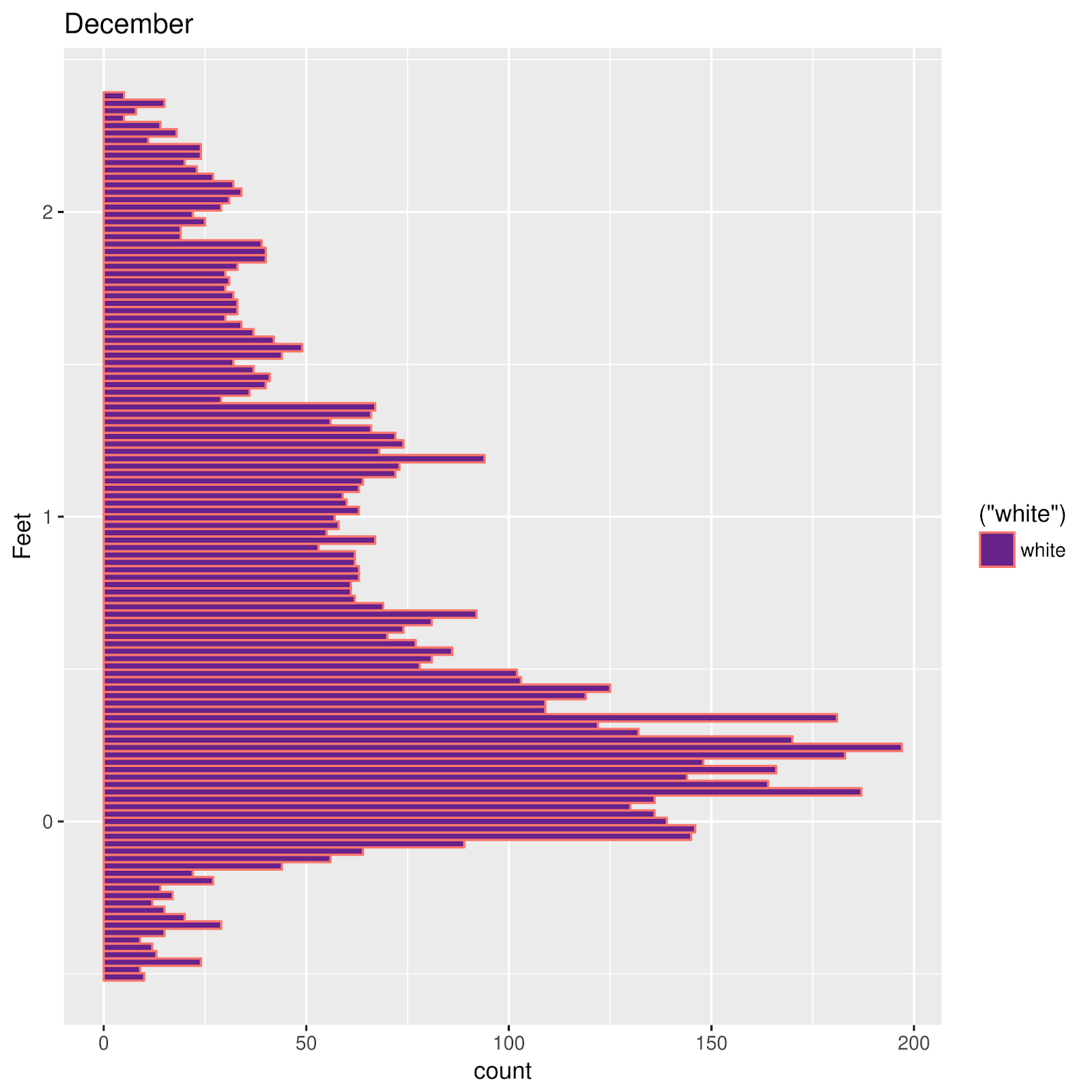
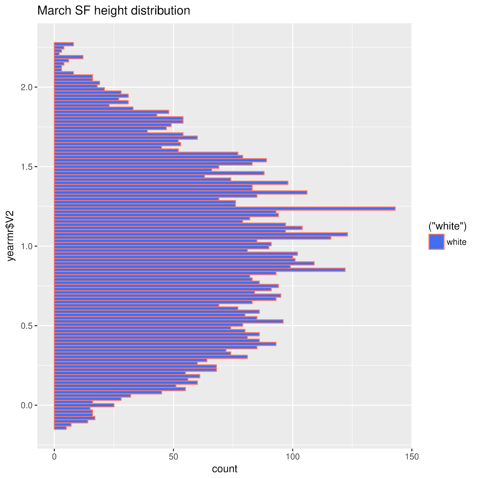
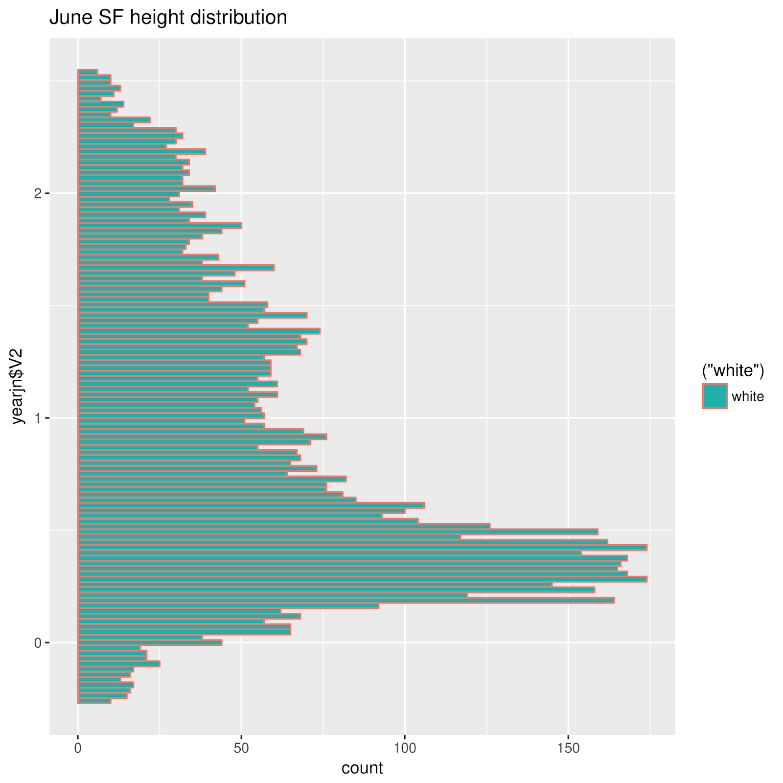
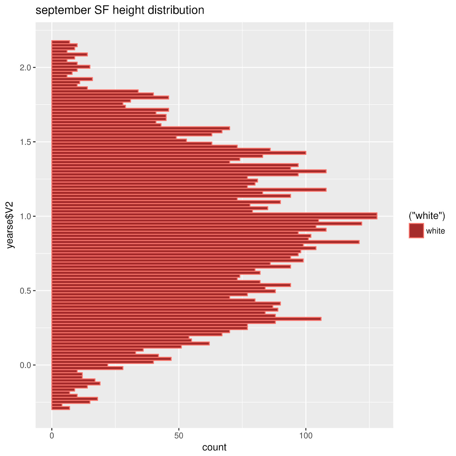
For how, the following is an effort from several months back, breaking down the probability distributions of heights month by month, for San Francisco's venerable tide gauge (thought these may be predictions). I wonder what this has to say in comparison with St. Petersburg, Florida's beeswarm plot. Obviously, it's impossible to compare them well using these two distinctly different methods. The top row shows frequency distributions for January, February, and March, and so on in the other rows; all graphs are from predictions.

One thing I noticed was a similarity of the distributions for June and December, around times of Solstices. The same may be said for the months of the Equinoxes, March and September. I now want to see another graph, the specific one-day distributions for the exact days of Solstices and Equinoxes. Other parameters, like apogee and perigee, perihelion and aphelion, lunar declination have important effects.
Comparing Two Sites (Full year of predictions for each)
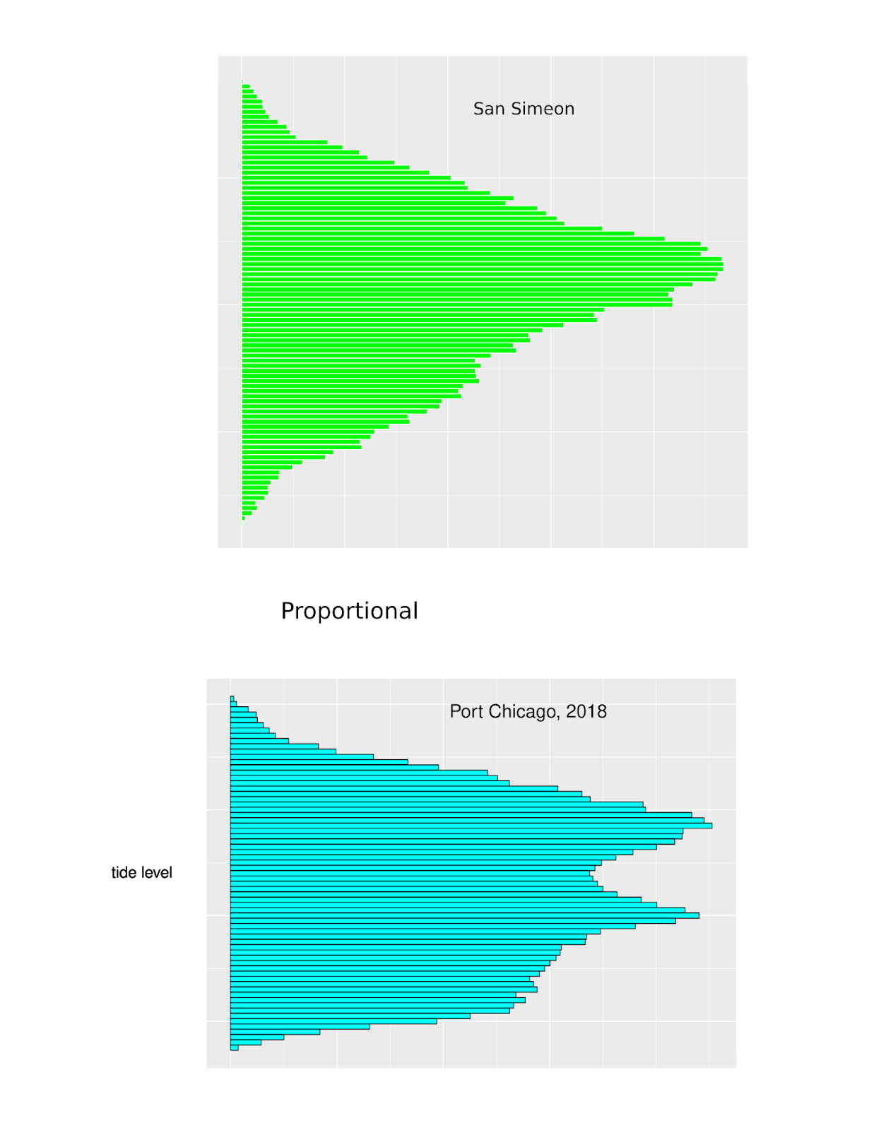
Port Chicago some 30 miles up the Northern Reach of San Francisco Bay, in Suisun Bay.
Months of Solstices and Equinoxes,
Chuuk Lagoon
 |
| December |
 |
| March |
 |
| June |
 |
| September |
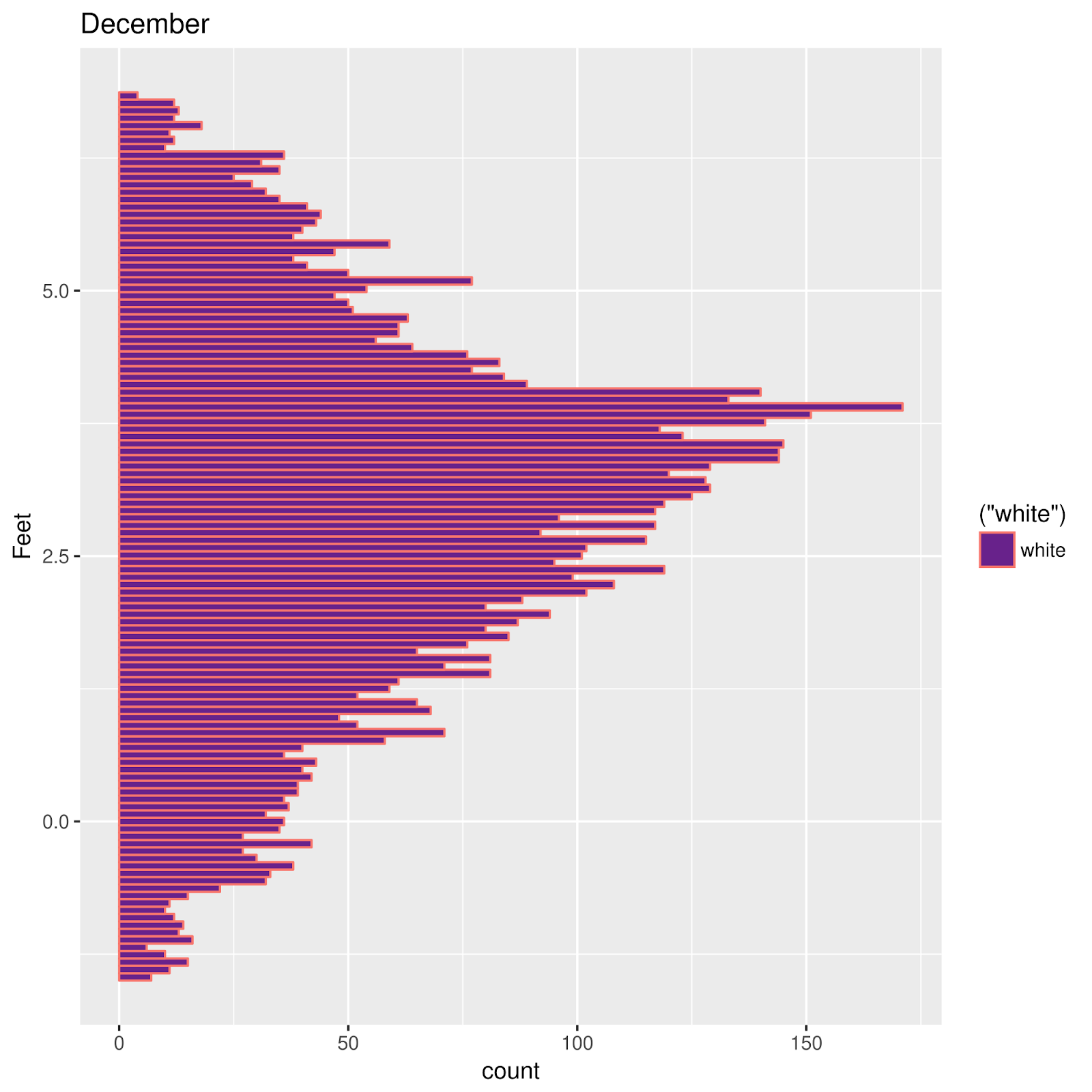
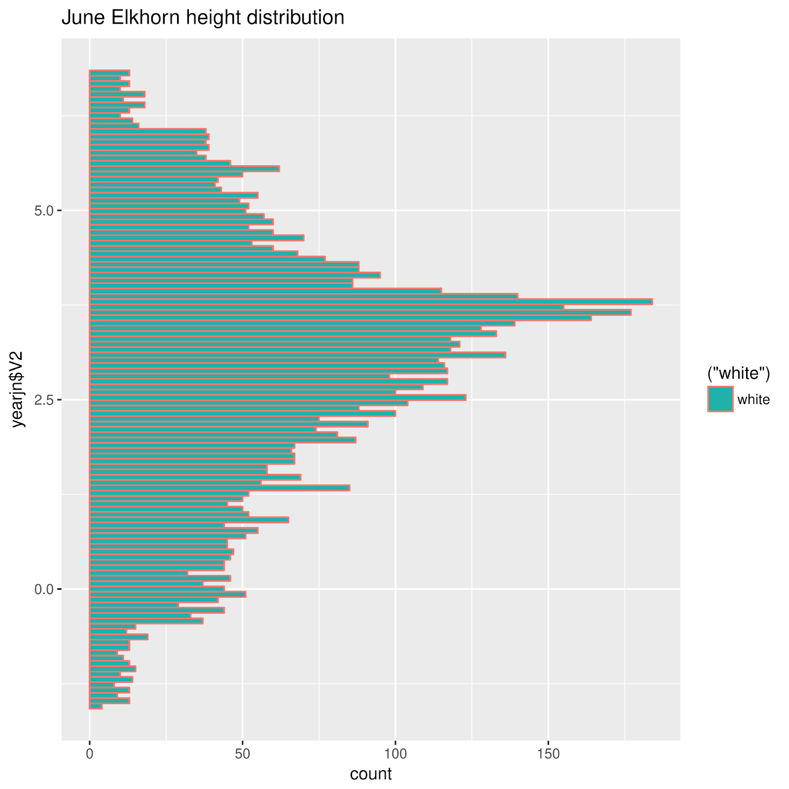
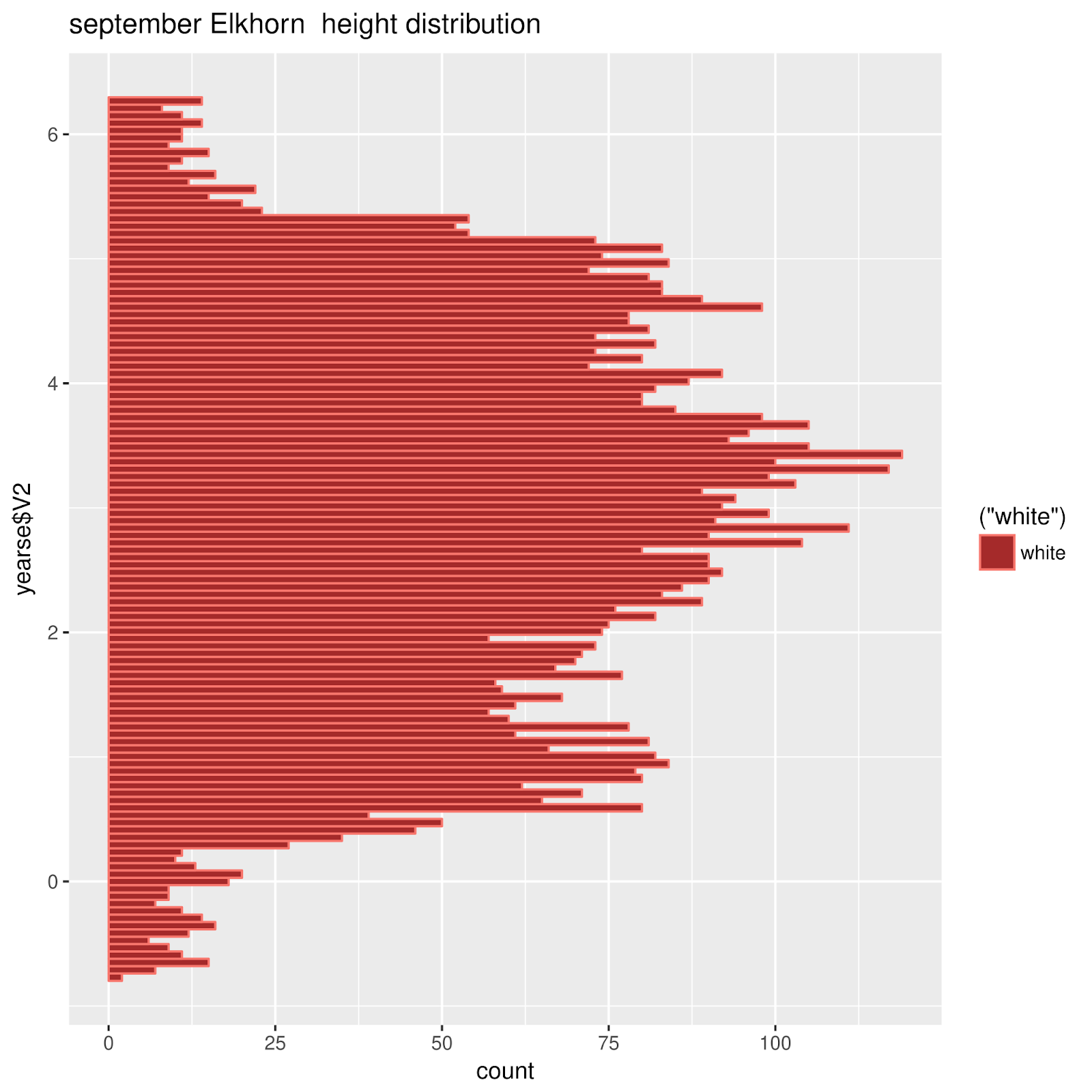
Equinoxes are in March and September. Solstices are in December and September. Why do the Equinoxes resember one another? Why do the Solstices resemble one another? ???
Elkhorn Slough December, March, June, and September
The differences between Elkhorn Slough and Chuuk Lagoon are notable.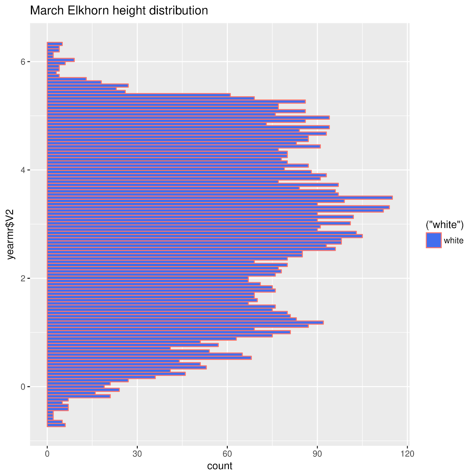 |
| March |
 |
| December |
 |
| June |
 |
| September |
Another distribution diagram: a continuous distribution curve.
This time, each month is traced in a different color. This is experimental; I did not keep a record of the colors for each month!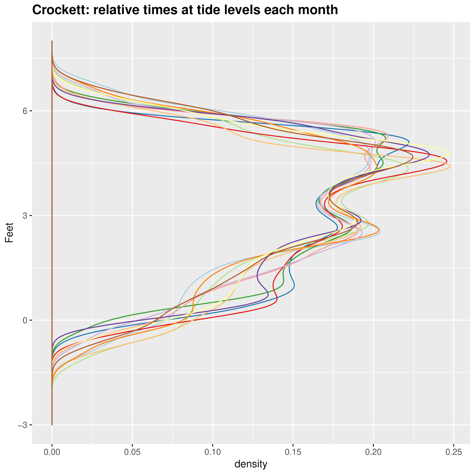
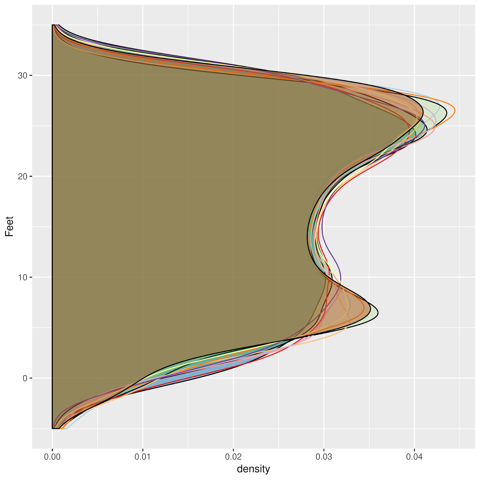
And another way to represent similar data, with transparent fill:
Saturday, August 10, 2019
Redwood City Tide Station

 |
| The business end. |

Saturday, August 3, 2019
A Beeswarm plot, for St. Petersburg, Florida
I'll try any kind of graph. Distribution frequency plots are described in Pugh's 1984 Sea Level Science. I saw a beeswarm plot, don't remember where; it seemed an interesting way to do a distribution frequency plot.
In a beeswarm plot, data is plotted along a single axis, in this case, tide water levels. No overlapping points are allowed; each overlapping point is "jittered" off to one side of the other point(s) at the
Are beeswarm plots informative? i tried. As usual I had to fiddle (speaking of which, a "violin plot" does something similar. Perhaps I'll try one). The "beeswarm" package for R makes production of these plots pretty easy. My first attempt suggested to me that a smaller amount of data might be more manageable. Eventually, something like this appeared, for St Petersburg, FL:
A first approximation: Predictions for June 17--28
Does the Moon figure into the distribution of water levels. I think this information is useful when considering intertidal zonation. The following is a beeswarm plot for hourly predictions for June, from New Moon to First
Quarter June 17--26). What, then, is this prominaent horizontal feature

Comparing with a plot for a couple of these days
Below, the same plot has been placed together with a plot of the tide at St Petersburg for two days in this period of time. The hold ups
seem to be encoded as the horizontal line

A Month at a Time
As a first approximation, I wondered whether it would be useful to divide time into quarter moons. The first reason: a useful number of points plotted on a single vertical beeswarm axis looks stupidly cluttered. Maybe it would be easier to plot short periods of time, like a month? No, a month was waaay to cluttered. A week looked alright.
A month at a time
So I used quarter moons. I have some misgivings about this choice. Next time I may CENTER the time division on a full moon, quarter moon, or new moon. Here, while it looks interesting, I'm pretty sure that much information about the actual full or new moon's influence.
I like it. It says something. The tides of St Petersburg exhibit some interesting quirks, reflected in these plots.
These are Beeswarm plots, a kind of univariate distribution plot, like histograms, and maybe a stem and leaf diagram of a kind. Each vertical plot represents a week (or so), hourly predictions for a quarter of the moon. Black, for example, represents the span between New Moon and First Quarter.

Maybe an inverted colorscheme would look better on the screen. The following was inverted in The Gimp, and exported as PNG, from a PDF.
Each vertical plot is a distribution plot, for one Quarter of a Lunar Cycle. The first one, in January, represents the period between NM and First Quarter (Q1), then Q1-> FM; FM -> Q3; Q3->NM, etc. 48 of these quarters are represented, from January into December of 2019.
These are predictions, from Xtide.
I don't know why almost everywhere I graph a tide, no matter how, something interesting pops up! What are we visualizing here?
Each vertical plot is a distribution plot, for one Quarter of a Lunar Cycle. The first one, in January, represents the period between NM and First Quarter (Q1), then Q1-> FM; FM -> Q3; Q3->NM, etc. 48 of these quarters are represented, from January into December of 2019.
These are predictions, from Xtide.
I don't know why almost everywhere I graph a tide, no matter how, something interesting pops up! What are we visualizing here?

Friday, July 19, 2019
Seasonal Distribution of the Time of Day of HIgh and LowTides
The following graphs are the result of my attempt to visualize the way that lower low tides and higher high tides are distributed in time. What do they say about the tides? Especially striking to me is their overall shapes. H. A. Marmer's study of the various nature of mixed tides is pertinent.
Marmer, Fig. 3

"The mixed type of tide merits more detailed consideration since this type comprises a great variety of different forms. These different forms may, however, be grouped into three large classes, namely those which feature the difference between the morning and afternoon tides chiefly in the low waters, those which feature it chiefly in the high waters, and those which feature it in approximately equal degree in both the high and low waters."
H. H. Marmer. 1931. Tidal Characteristics from Harmonic Constants. The International Hydrographic Review 2.
In the above graph, Marmer refers to Seattle, Honolulu, and San Diego as examples of these three categories of tide regime.
The making of the following began from a desire to understand the distribution of higher and lower tides from a seasonal perspective. Perhaps they will also do, to elaborate on the theme of Marmer. The distribution of times over the seasons seem remarkably bimodal. The different forms of these three mixed tides is striking. There is much more to Marmer's analysis, perhaps best left for another time.
 |
| Seattle, WA: Differences in Low Waters. |
 |
| Transitional between Seattle and La Jolla. |
 |
| Differences in both high and low waters |
Thursday, July 18, 2019
A Gem of Untold Worth: Pages Torn out from Albert Defant's Physical Oceanography, V.II.
I have tried to at least review all the literature I can lay my hands on, about anything having to do with tides. Several books, and a number of papers stand apart. Another time, I plan to generate a list. Real Soon Now (TM). Among books, one of the classic textbooks of Oceanography is the 1961 two-volume Physical Oceanography, by Albert Defant. In Volume 2 are found lengthy treatments of various aspects of tides. It is available in English translation on Archive.org, in various formats: Defant. Physical Oceanography, V. II. No other book has gone to that much extent, particularly in discussion of the features of tides of various locations around the world.
As I prefer printed books, I checked volume II out from the UC Berkeley Libraries. A troubling revelation was received.
It has been my unfortunate observation that not all academics are community minded. At UCSB, for example, many of the previously numerous volumes dealing with fishing have been stolen or otherwise have disappeared. Of those that remained as of about 1983-1984, I found several with pages removed, presumably because of their overriding usefulness to someone---hopefully who would make a contribution to the greater body of knowledge, to compensate for this selfish act.
More distressing was to find pages torn out in exactly two places in one copy of Defant's volume II from the UC Berkeley Library. These pages I was able to locate in the Internet Archive (archive.org), as *tif files; I printed these pages out and placed them in the books so they would be available to anyone who referred to this book in the future---possibly me!
Beyond the thoughtless act of removing these pages, the perpetrator left behind a bookmark: once I had noticed these pages were missing: the content of the missing pages was astounding. May I turn a blind eye to copyrights? Well, I think this book is no longer covered by those draconian and troublesome restrictions; I shall present the missing pages here.


I do not know who removed these pages. One can appreciate their unique value, even from the distance of over 50 years.
In the Caroline Islands, experts value their knowledge---particularly of navigation, fishing, or cures---highly. They fear to share it with others, lest it be squandered, and their personal power diminished. A traditional expert will choose very carefully whom he may train in his knowledge or skills. Likewise, A prospective pupil, would cultivate the expert's favor, even to the extent of sharing a fish with a navigator every time he goes fishing, for tens of years! Eventually, the expert may take the hopeful understudy aside and offer to tutor him. This is a very serious matter.
Likewise in Western society, knowledge is jealously guarded. Beyond arcane practices in academic culture, and, say, the scribbled handwriting and esoteric vocabulary, or even shoptalk among craftsmen, many more examples could be adduced.
I cannot know what was going through the mind of the thief of these pages. Perhaps this was in a time preceding xerox machines. Or maybe he had no change, was late for his ride, or faced a deadline that he or she could not make without this precious knowledge. Did a librarian---whose annoying dispositions used to be legendary---refuse to check the book out to our aspirant to this knowledge?
Unfortunately, I cannot render judgement on this seemingly callous and self-serving act. The outcome, though, is a positive one: I might not have made such careful note of these pages, had they not been missing.
It's good stuff.
As I prefer printed books, I checked volume II out from the UC Berkeley Libraries. A troubling revelation was received.
It has been my unfortunate observation that not all academics are community minded. At UCSB, for example, many of the previously numerous volumes dealing with fishing have been stolen or otherwise have disappeared. Of those that remained as of about 1983-1984, I found several with pages removed, presumably because of their overriding usefulness to someone---hopefully who would make a contribution to the greater body of knowledge, to compensate for this selfish act.
More distressing was to find pages torn out in exactly two places in one copy of Defant's volume II from the UC Berkeley Library. These pages I was able to locate in the Internet Archive (archive.org), as *tif files; I printed these pages out and placed them in the books so they would be available to anyone who referred to this book in the future---possibly me!
Bookmarks left in Defant by an astute reader
Beyond the thoughtless act of removing these pages, the perpetrator left behind a bookmark: once I had noticed these pages were missing: the content of the missing pages was astounding. May I turn a blind eye to copyrights? Well, I think this book is no longer covered by those draconian and troublesome restrictions; I shall present the missing pages here.
The first page was an accounting of Harmonic Constituents.
The first of these two pages is the most important: a listing of Principal harmonic components (constituents). All of these images are *.tif files. You may click on them to enlarge them, and they are printable.

2. Pages later in the book: remarkable! How to interpret the above.
I do not know who removed these pages. One can appreciate their unique value, even from the distance of over 50 years.
In the Caroline Islands, experts value their knowledge---particularly of navigation, fishing, or cures---highly. They fear to share it with others, lest it be squandered, and their personal power diminished. A traditional expert will choose very carefully whom he may train in his knowledge or skills. Likewise, A prospective pupil, would cultivate the expert's favor, even to the extent of sharing a fish with a navigator every time he goes fishing, for tens of years! Eventually, the expert may take the hopeful understudy aside and offer to tutor him. This is a very serious matter.
Likewise in Western society, knowledge is jealously guarded. Beyond arcane practices in academic culture, and, say, the scribbled handwriting and esoteric vocabulary, or even shoptalk among craftsmen, many more examples could be adduced.
I cannot know what was going through the mind of the thief of these pages. Perhaps this was in a time preceding xerox machines. Or maybe he had no change, was late for his ride, or faced a deadline that he or she could not make without this precious knowledge. Did a librarian---whose annoying dispositions used to be legendary---refuse to check the book out to our aspirant to this knowledge?
Unfortunately, I cannot render judgement on this seemingly callous and self-serving act. The outcome, though, is a positive one: I might not have made such careful note of these pages, had they not been missing.
It's good stuff.
Tuesday, July 16, 2019
San Francisco, Hawaii, and Guam exhibit seasonal modes on Tide vs Time of Day graphs
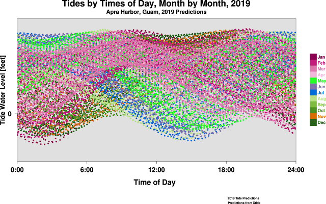
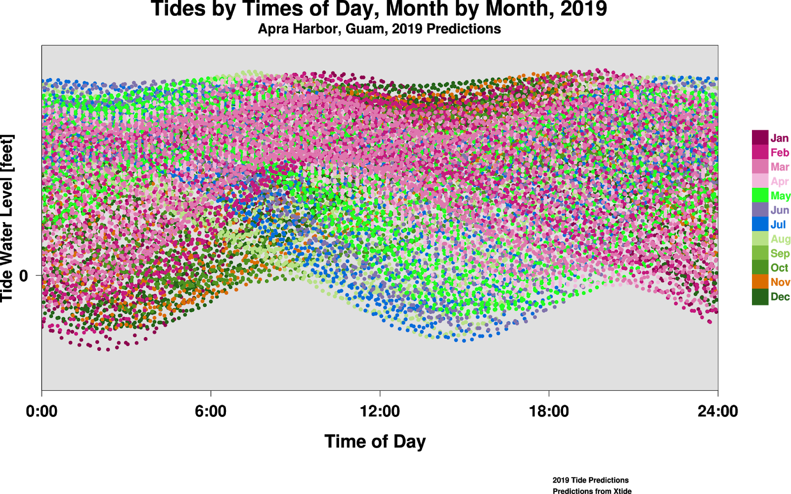
I started to make these graphs because I want to understand the nature of the seasonality of the lowest and highest tides. One of my professors, Roy Tsuda opened my eyes to certain aspects of tidal zonation, and, somehow, to the idea that there is some kind of seasonality to tides. MY interest in the Tidepool, in all of the Intertidal have biased my point of view toward the times of lowest LLW during different months of the year. However, as the graph of Kawaihae, Hawaii shows, some sites show more variation in HHW (Higher High Water) through the year.
These graphs take a certain amount of manual data manipulation to generate times of day from the times of the tide predictions. I will be making more of them. In his book Sea Level Science, David Pugh discusses various varieties and aspects of tides. Especially, Albert Defant's Physical Oceanography, Volume II gives detailed discussions. One of these, or perhaps others, certainly will have information about the astronomical and oceanographic factors behind the differences in these profiles.
Looking at these, I know there is more to learn about this. I'm willing to have posters printed, if anyone is interested. One possibility would be a large poster with several such graphs. I've tried to use colorblind-friendly colors, but this is a work in progress. For one thing, gri does not have the same color palette support as R. And for another, there are a number of varieties of color blindness, each of them just as different from the next, as from my own "Normal" color vision. What would these look like to a stomatopod (with 10 cone types, I think)?

These graphs take a certain amount of manual data manipulation to generate times of day from the times of the tide predictions. I will be making more of them. In his book Sea Level Science, David Pugh discusses various varieties and aspects of tides. Especially, Albert Defant's Physical Oceanography, Volume II gives detailed discussions. One of these, or perhaps others, certainly will have information about the astronomical and oceanographic factors behind the differences in these profiles.
Looking at these, I know there is more to learn about this. I'm willing to have posters printed, if anyone is interested. One possibility would be a large poster with several such graphs. I've tried to use colorblind-friendly colors, but this is a work in progress. For one thing, gri does not have the same color palette support as R. And for another, there are a number of varieties of color blindness, each of them just as different from the next, as from my own "Normal" color vision. What would these look like to a stomatopod (with 10 cone types, I think)?
San Francisco
 Kawaihae, Hawaii Island


Apra Harbor, Guam
Article: High Tide Flooding Days in 2018
https://www.noaa.gov/media-release/us-ties-record-for-number-of-high-tide-flooding-days-in-2018
Sunday, July 14, 2019
Distribution plots of times of day of high and low tides. A work in progress.
Roy Tsuda, professor of Marine Botany at the University of Guam, is an enthusiast of tides. His lecture on the ideas of one of his professors, Max Doty about intertidal zonation made an impression on me. I'm not sure now, some 35 years later, whether he had something to do with instilling me a strong interest in the times of high and low tides. I think he did.
In Chuuk Lagoon, I learned that at the time when "a pwopwooisor" (the tide was pregnant or swollen [pwopwo} in the morning [isor], certain bivalves are ripe to eat---with a growth of orange matter, obviously eggs. I also heard a casual remark that "the tide has changed" in reference to the times of high and low tides.
How to graph this relationship, to analyze and grow our understanding? Ideas pop out of the graphs, ideas the inkling that prodded me to start in the first place. These are distribution plots, not a track through time, like a tide calendar. I want to see what times of day are the tides highest or lowest, and during which months? When it takes several years to produce something, is it a work in progress?
Time of day is the independent variable, the X axis. Predicted heights are the dependent variable. Different colors encode the months.
Studying some of the graphs it is apparent that a "month" is not a natural division of time; in certain cases there are what look like different modes within a "month." A lunar calendar might work better. Or maybe not. Tides are complicated. Traditional fishermen, without the benefit of calendars, ephemerides, or clocks, understand the division of time in a more practical sense.
In Chuuk Lagoon, I learned that at the time when "a pwopwooisor" (the tide was pregnant or swollen [pwopwo} in the morning [isor], certain bivalves are ripe to eat---with a growth of orange matter, obviously eggs. I also heard a casual remark that "the tide has changed" in reference to the times of high and low tides.
How to graph this relationship, to analyze and grow our understanding? Ideas pop out of the graphs, ideas the inkling that prodded me to start in the first place. These are distribution plots, not a track through time, like a tide calendar. I want to see what times of day are the tides highest or lowest, and during which months? When it takes several years to produce something, is it a work in progress?
Time of day is the independent variable, the X axis. Predicted heights are the dependent variable. Different colors encode the months.
Studying some of the graphs it is apparent that a "month" is not a natural division of time; in certain cases there are what look like different modes within a "month." A lunar calendar might work better. Or maybe not. Tides are complicated. Traditional fishermen, without the benefit of calendars, ephemerides, or clocks, understand the division of time in a more practical sense.
Subscribe to:
Posts (Atom)
-
 Just one image among many on the Internet, of a tide machine, together with Arthur Doodson, who used such tide engines to profile the tides...
 -
 An alternative approach to visualization of tides has been provided by Ron Hipschman, of San Francisco's Exploratorium. A friend had as...
 -
 The Australian term Dodge Tide refers to a time when at least one tide is skipped, during a neap tide. A popular description of Dodge...